
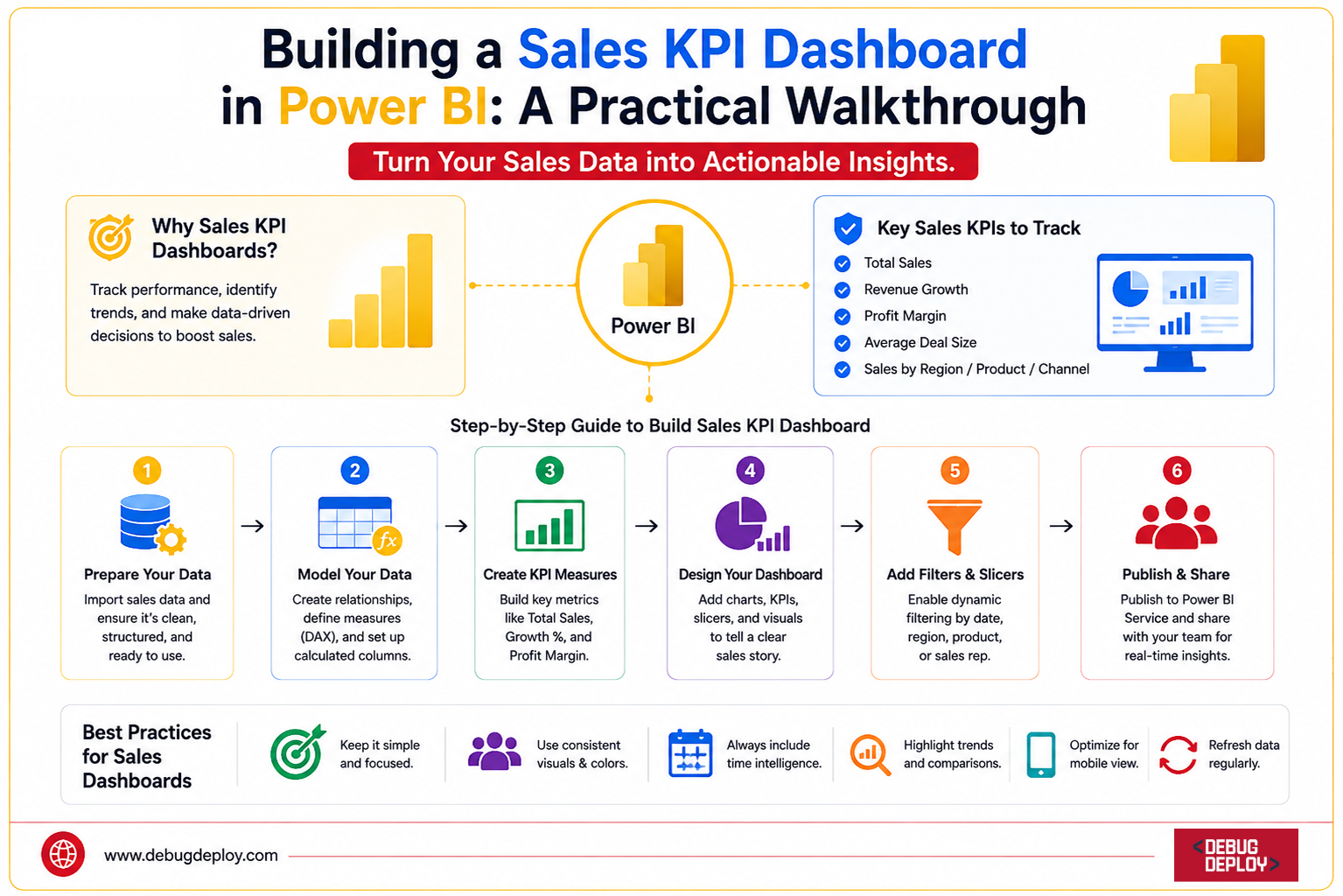
Introduction
In today’s competitive business environment, organizations rely heavily on data to make informed decisions. Sales teams generate enormous amounts of data every day, but raw numbers alone do not provide actionable insights. This is where Key Performance Indicator (KPI) dashboards become essential.
A well-designed Sales KPI Dashboard in Power BI helps businesses monitor performance, identify trends, track targets, and make data-driven decisions in real time. Instead of manually analyzing spreadsheets, decision-makers can view critical sales metrics in a single interactive dashboard.
Organizations rely significantly on data to make well-informed decisions in the cutthroat business world of today. Every day, sales teams produce massive amounts of data, yet these figures by themselves do not yield useful insights. Key Performance Indicator (KPI) dashboards are crucial in this situation.
Businesses can set goals, monitor performance, spot patterns, and make data-driven choices in real time with the aid of a well-designed Sales KPI Dashboard in Power BI. Decision-makers may monitor important sales KPIs in a single interactive dashboard rather than having to manually analyze spreadsheets.
What Is a Sales KPI Dashboard?
A Sales KPI Dashboard is a visual reporting tool that displays the most important sales metrics in one centralized location.
It enables stakeholders to monitor:
Revenue performance
Sales growth
Profitability
Customer acquisition
Regional performance
Product sales trends
Sales target achievement
The goal is to transform complex sales data into easy-to-understand visual insights.
Why Use Power BI for Sales Dashboards?
Microsoft Power BI is one of the most popular business intelligence platforms available today.
Organizations choose Power BI because it offers:
Interactive visualizations
Real-time reporting
Data integration from multiple sources
Advanced analytics
AI-powered insights
User-friendly dashboard design
Cloud-based sharing and collaboration
With Power BI, businesses can create executive-level sales dashboards without requiring extensive coding skills.
Step 1: Define Your Sales KPIs
Before building a dashboard, identify the metrics that matter most to your business.
Common Sales KPIs include:
Total Revenue
Measures overall sales performance.
Example:
Monthly Revenue
Quarterly Revenue
Annual Revenue
Sales Growth Percentage
Tracks performance improvement over time.
Example:
Month-over-Month Growth
Year-over-Year Growth
Profit Margin
Measures profitability after expenses.
Number of Orders
Shows transaction volume.
Average Order Value (AOV)
Calculates average revenue per order.
Top Products
Identifies best-selling products.
Top Sales Representatives
Highlights high-performing salespeople.
Sales Target Achievement
Compares actual sales against predefined goals.
Selecting the right KPIs ensures your dashboard focuses on business objectives rather than unnecessary metrics.
Step 2: Prepare Your Sales Data
For this walkthrough, assume you have a sales dataset containing:
Order Date | Product | Region | Sales Rep | Revenue | Profit |
01-Jan-2026 | Laptop | North | John | 1200 | 250 |
03-Jan-2026 | Monitor | South | Sarah | 450 | 90 |
05-Jan-2026 | Keyboard | East | Mike | 120 | 30 |
Your data may come from:
Excel files
SQL Server
SharePoint
Dynamics 365
Salesforce
Azure SQL Database
ERP systems
The cleaner your data, the better your dashboard performance.
Step 3: Import Data into Power BI
Open Power BI Desktop.
Select:
Home → Get Data
Choose your data source.
For example:
Excel Workbook
SQL Server
CSV File
SharePoint Folder
Load the data into Power BI.
After importing, review the tables and verify that all columns have the correct data types.
For example:
Dates should be Date format.
Revenue should be Currency.
Quantity should be Whole Number.
Accurate data types improve reporting accuracy.
Step 4: Clean and Transform Data
Navigate to:
Transform Data
This opens Power Query Editor.
Common cleaning tasks include:
Removing duplicates
Fixing null values
Renaming columns
Formatting dates
Creating calculated columns
Standardizing categories
For example:
Convert inconsistent region names:
North
NORTH
north
into a single value:
North
Clean data creates reliable KPIs.
Step 5: Build a Data Model
A strong data model is the foundation of every Power BI dashboard.
If your data contains multiple tables, create relationships between them.
Common tables include:
Sales Fact Table
Product Dimension
Customer Dimension
Date Table
Region Table
Using a star schema improves performance and simplifies report development.
A properly designed model ensures accurate calculations and faster dashboard loading times.
Step 6: Create KPI Measures Using DAX
Measures calculate your KPIs dynamically.
Total Revenue
Total Revenue = SUM(Sales[Revenue])
Total Profit
Total Profit = SUM(Sales[Profit])
Total Orders
Total Orders = COUNT(Sales[OrderID])
Average Order Value
Average Order Value =
DIVIDE([Total Revenue],[Total Orders])
Profit Margin %
Profit Margin % =
DIVIDE([Total Profit],[Total Revenue])
Sales Growth %
Sales Growth % =
DIVIDE(
[Current Month Sales]-[Previous Month Sales],
[Previous Month Sales]
)
These measures form the core of your dashboard.
Step 7: Design KPI Cards
The first section of your dashboard should contain KPI cards.
Add Card visuals for:
Total Revenue
Total Profit
Total Orders
Profit Margin
Sales Growth
Arrange them horizontally at the top.
This provides executives with an instant performance overview.
A typical layout might display:
Revenue: $2.4M
Profit: $420K
Orders: 8,500
Margin: 17%
Growth: 12%
These high-level metrics are usually the most viewed elements of any sales dashboard.
Step 8: Add Sales Trend Analysis
Create a Line Chart showing:
Date on X-axis
Revenue on Y-axis
This visual helps identify:
Seasonal trends
Growth patterns
Sales fluctuations
Executives often use trend analysis to forecast future performance and plan business strategies.
Step 9: Visualize Regional Performance
Add a Map Visual or Bar Chart displaying:
Region
Revenue
This allows users to compare sales performance across locations.
For example:
North: $750K
South: $600K
East: $550K
West: $500K
Regional insights help organizations allocate resources effectively.
Step 10: Analyze Product Performance
Create a Bar Chart showing:
Product Category
Revenue
This identifies:
Best-selling products
Underperforming products
Revenue contribution by category
Understanding product performance supports inventory planning and marketing decisions.
Step 11: Track Sales Representative Performance
Add a leaderboard chart displaying:
Sales Representative
Revenue Generated
This visual helps management:
Reward top performers
Identify coaching opportunities
Measure team productivity
Interactive filtering allows managers to evaluate performance by region or period.
Step 12: Add Interactive Filters
Slicers make dashboards more flexible.
Common filters include:
Date
Region
Product Category
Sales Representative
Users can customize views without modifying the report.
Interactivity significantly enhances dashboard usability.
Step 13: Improve Dashboard Design
Effective dashboard design is just as important as the data itself.
Best practices include:
Use consistent colors
Avoid clutter
Highlight key metrics
Maintain alignment
Use meaningful titles
Limit visuals per page
A clean dashboard improves user adoption and decision-making speed.
Step 14: Publish and Share
Once complete:
Save the report
Publish to Power BI Service
Configure permissions
Share with stakeholders
Users can access dashboards through:
Web browsers
Mobile devices
Microsoft Teams
Embedded applications
This enables real-time collaboration across the organization.
Common Mistakes to Avoid
Many new Power BI developers make avoidable mistakes.
Avoid:
Overloading dashboards with visuals
Using too many colors
Ignoring performance optimization
Creating unclear KPIs
Skipping data validation
Building reports without business objectives
A dashboard should answer business questions, not simply display data.
Benefits of a Sales KPI Dashboard
Organizations that implement Power BI sales dashboards gain several advantages:
Faster decision-making
Increased visibility into performance
Improved sales forecasting
Better accountability
Enhanced team productivity
Real-time business insights
These benefits contribute directly to revenue growth and operational efficiency.
Conclusion
One of the most useful and effective ways to turn sales data into useful business intelligence is to create a Sales KPI Dashboard in Power BI. Organizations may obtain a clear picture of their sales success at every level by integrating clean data, significant KPIs, potent DAX measures, and user-friendly graphics.
A good dashboard provides a story about revenue growth, profitability, customer behavior, and team performance in addition to displaying numbers. Whether you work as a sales manager, business analyst, or aspiring Power BI developer, becoming proficient in dashboard development will enable you to provide insights that lead to more intelligent choices and quantifiable business results.
As businesses continue to embrace data-driven strategies in 2026 and beyond, Power BI remains one of the most valuable tools for building interactive, scalable, and enterprise-ready sales analytics solutions.
Want to Build Professional Sales Dashboards With Microsoft Power BI?
Get trained by a Microsoft Certified Trainer (MCT) and learn how to create interactive sales KPI dashboards that help businesses track performance and make data-driven decisions.
Recommended Microsoft Power BI Certification Programs:
PL-300: Microsoft Power BI Data Analyst
PL-900: Microsoft Power Platform Fundamentals
DP-900: Microsoft Azure Data Fundamentals
DP-600: Implementing Analytics Solutions Using Microsoft Fabric
✅ Live Instructor-Led Training
✅ Sales KPI Dashboard Development
✅ Power Query, DAX & Data Modeling Skills
✅ Interactive Reports & Executive Dashboards
✅ Real-World Business Intelligence Projects
✅ Certification Exam Preparation & Guidance
📧 Email: trainings@debugdeploy.com
📱 WhatsApp: Contact us for quick assistance
Master Microsoft Power BI and gain hands-on experience building professional sales dashboards, tracking KPIs, and delivering actionable business insights with confidence.